LOGOS


Planet ark - logo refresh
As part of the brand refresh I devised for Planet Ark Environmental Foundation, I refreshed the Planet Ark logo, which hadn’t been updated since the 90s. I had to be careful with this logo as it is very well known in Australia, so I didn’t want to compromise our strong brand recognition by creating something entirely different. Certain features of the old logo needed to be updated, however: it looked very dated, and its sharp edges and thick black strokes didn’t really connect with the work Planet Ark does, which is much more circular in nature (not just the shape of our planet, but also our work in the circular economy, recycling, nature regeneration and so on). The old logo was also the only logo Planet Ark had - we lacked a comprehensive logo system for flexible use across a range of contexts.
For the logo refresh, I kept the well-known shape and the colour blue from our brand, but softened and modernised the look and feel of the logo. I customised a more modern font by slightly rounding out its edges (to echo the round shape of our Planet and also the work that Planet Ark does) and expanded the kerning (space between the letters) to allow for a more spacious, less ‘boxed-in’ feeling. I also made the box stroke thinner and removed the redundant line separating the words in the logo.
After refreshing the standard logo, I created a logo system for Planet Ark to use, including a responsive logo, wordmark, branded tagline circles, mono versions, etc.
The new logo(s) were approved by the Planet Ark Executive Team and the Board of Directors, and launched as part of the overall brand refresh I completed in mid-2024. To view the entire brand refresh, please visit the Branding section of my portfolio.


THE SEEDLING BANK LOGO
I designed the logo for The Seedling Bank (a subsidiary campaign of Planet Ark’s National Tree Day). I have included some images showing the logo development process, including the first three options I devised using the golden ratio, and then the fine-tuning of the final logo. The logo development process involved liaising with management and executive teams each step of the way. The final logo was approved by the Executive Team and Board of Directors and launched in early 2024.
Note: I also developed a branding package for The Seedling Bank, which you can view on the Branding page of my portfolio.


ace awards logo
I designed the logo for the 2022 and 2023 Australian Circular Economy (ACE) Awards. The logo needed to reflect the partnership between the ACE Awards founders: the Australian Circular Economy Hub (ACE Hub) and the Circularity conference, so I created a logo that ‘merges’ these two brands. Apart from dark and light versions of the logo, I also created circular versions of it for use on various assets (certificates, trophies, social media, etc.). The assets I created for the ACE Awards themselves included:
Collaborating on trophy design with DEFY design (the trophies were made out of recycled materials) and designing a template for the trophy plaque
Certificates for winners and nominees
Animated digital screens for the Awards event (including awards categories, nominees, winners, holding slides, etc.)
Promotional materials for the Awards including social media tiles, eDM banners, email signatures, etc.
Brand guidelines with rules for logo use


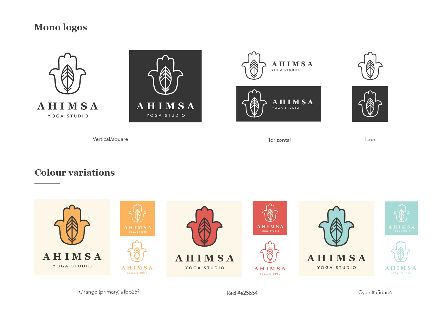
AHIMSA YOGA LOGO
I designed the logo for my own yoga business, Ahimsa Yoga. ‘Ahimsa’ means ‘non-harm’ in Sanskrit. The hamsa hand represents protection, and the feather in the middle is a symbol of fragility/softness. I really wanted a symmetrical logo with soft edges (so that it’s balanced and harmonious, subtly communicating the theme of non-violence), and a warm colour scheme so that students feel welcome and safe. My favourite colour is orange and I also have a love for retro themes, so I chose orange as the primary brand colour and then a series of complementary vintage tones.


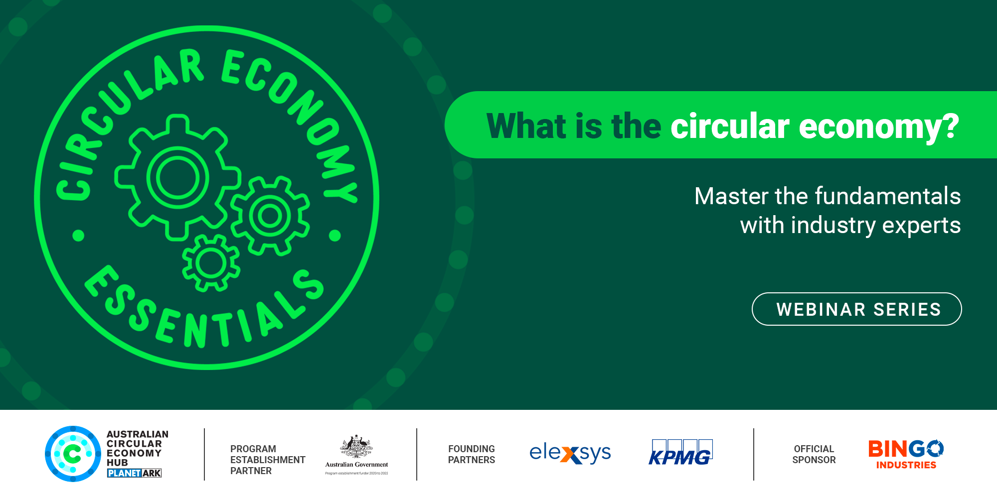


circular economy fundamentals logo
I designed the logo for Circular Economy Fundamentals (CEF), a training programme run by the Australian Circular Economy Hub (ACE Hub). The name of the training programme wasn’t set in stone when I was asked to begin the logo design, so that entered into the logo design process and explains some of my early concepts. I also had to keep to the colour scheme in use by the ACE Hub, so this bright and dark green combo originated there.
The logo with the cogs was selected as the most suitable for the programme, approved by ACE Hub Managers and by the Planet Ark Executive Team, and then launched in 2023. Apart from the logo itself, I also designed all the promotional assets for the training programme, including social tiles, eDM banners, website banners, and PowerPoint templates for the training team to use.