Flyers
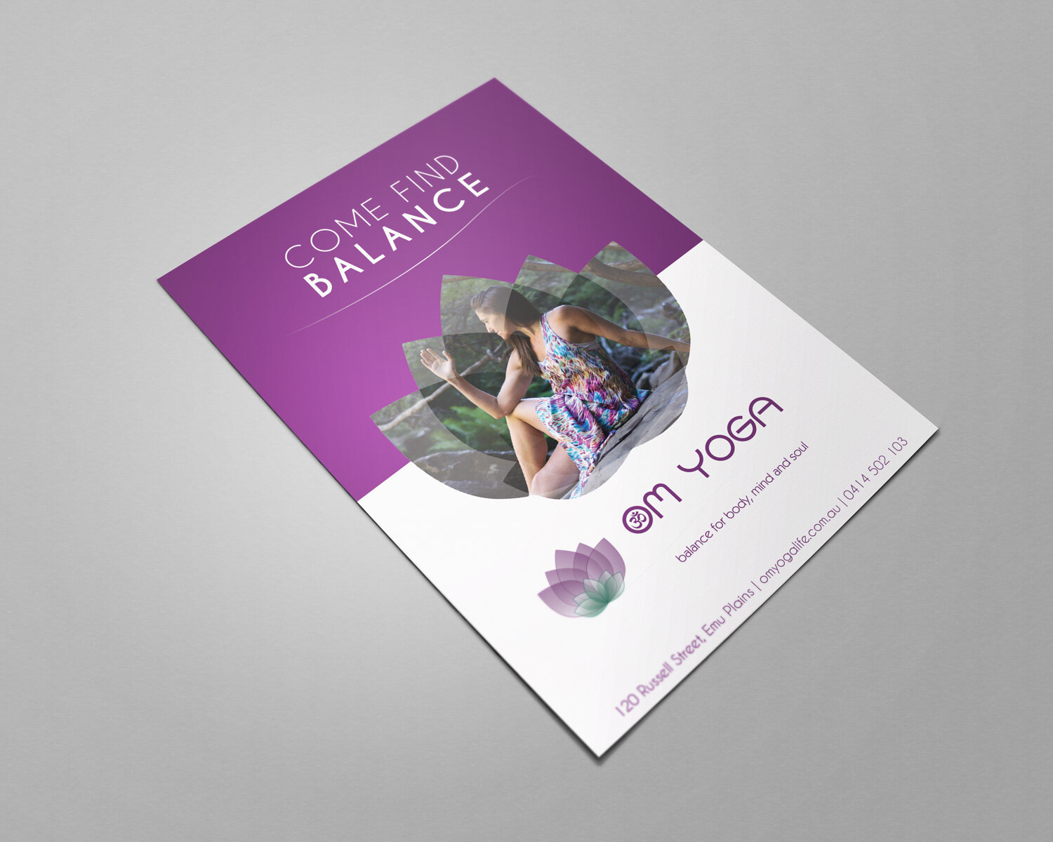
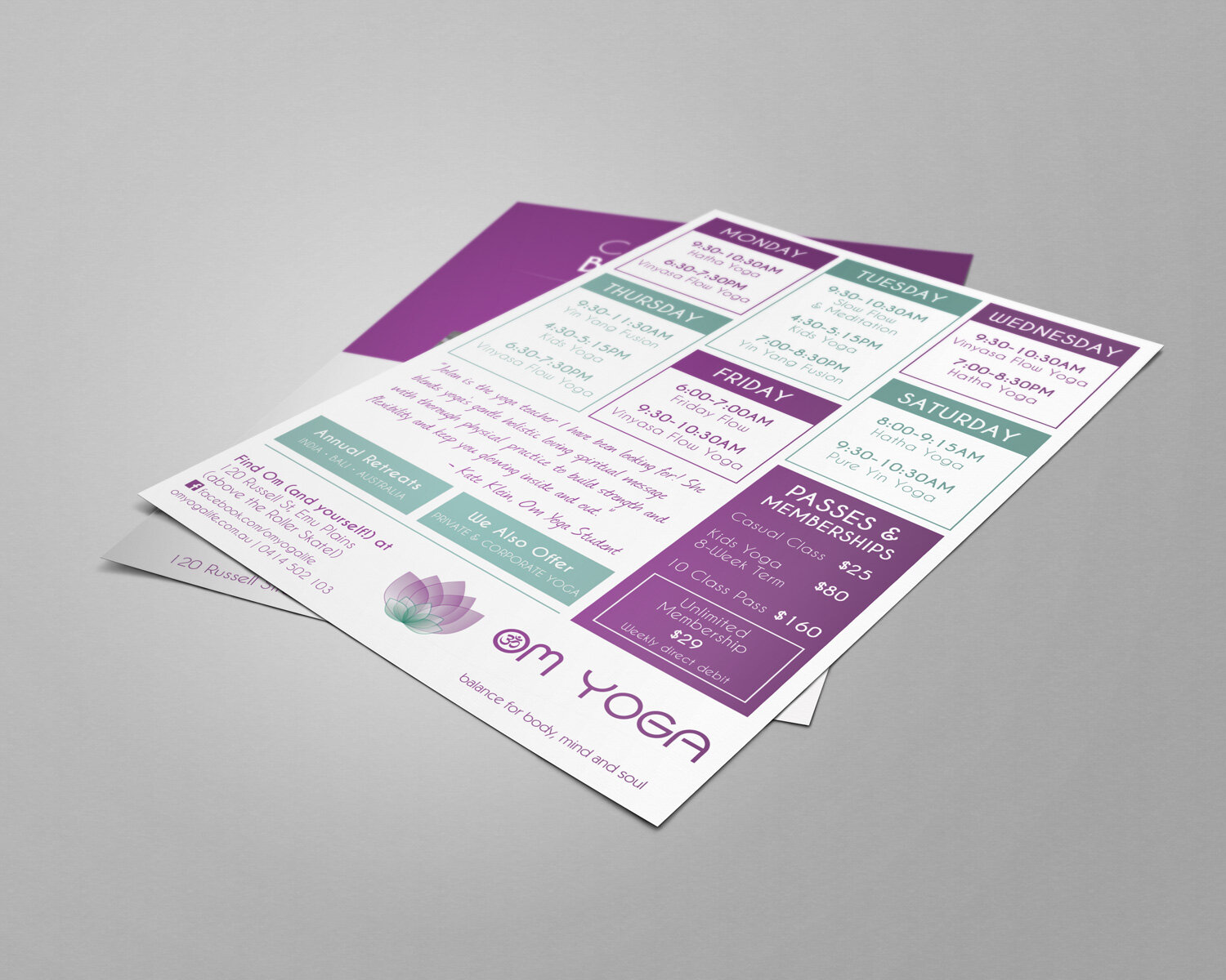
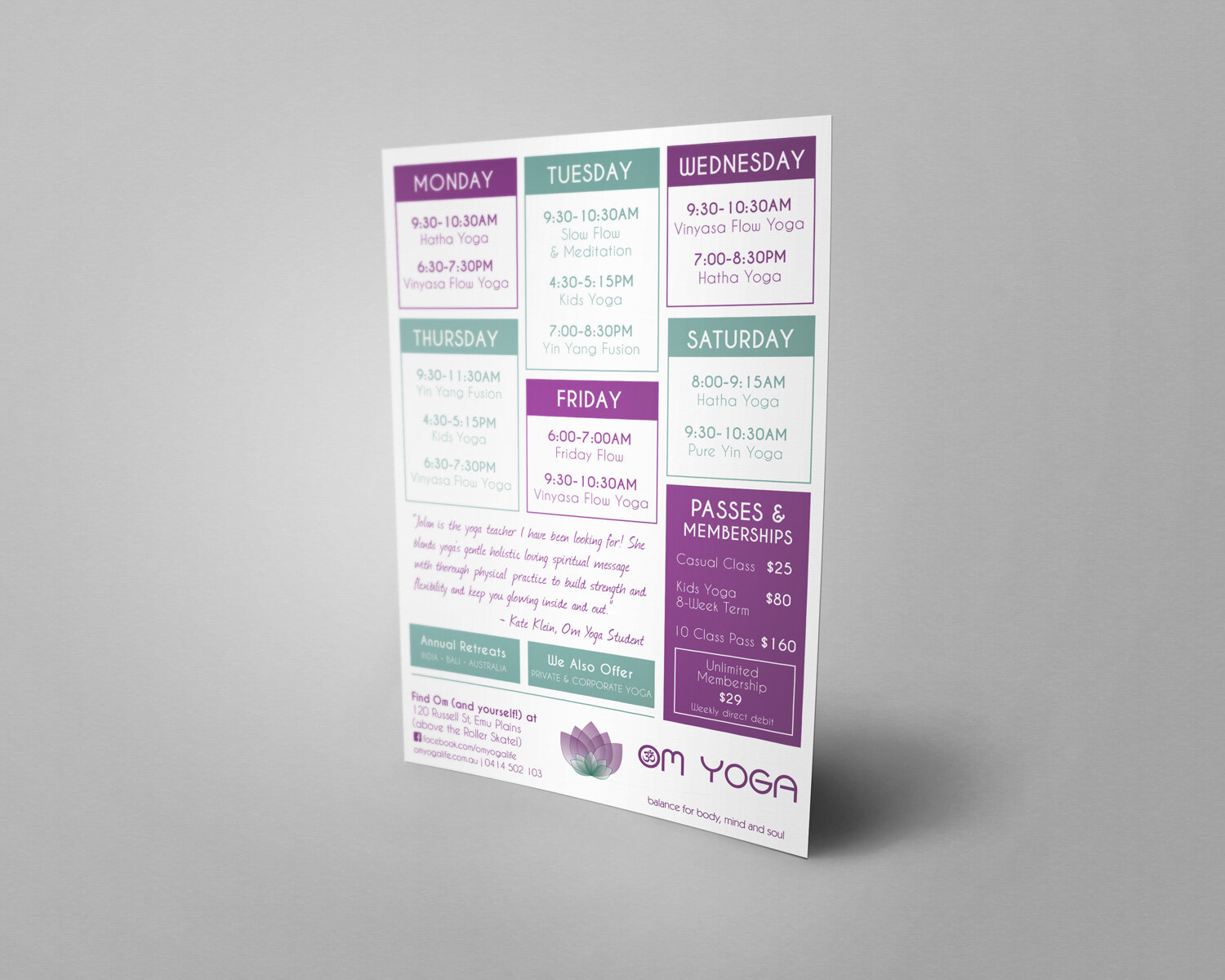
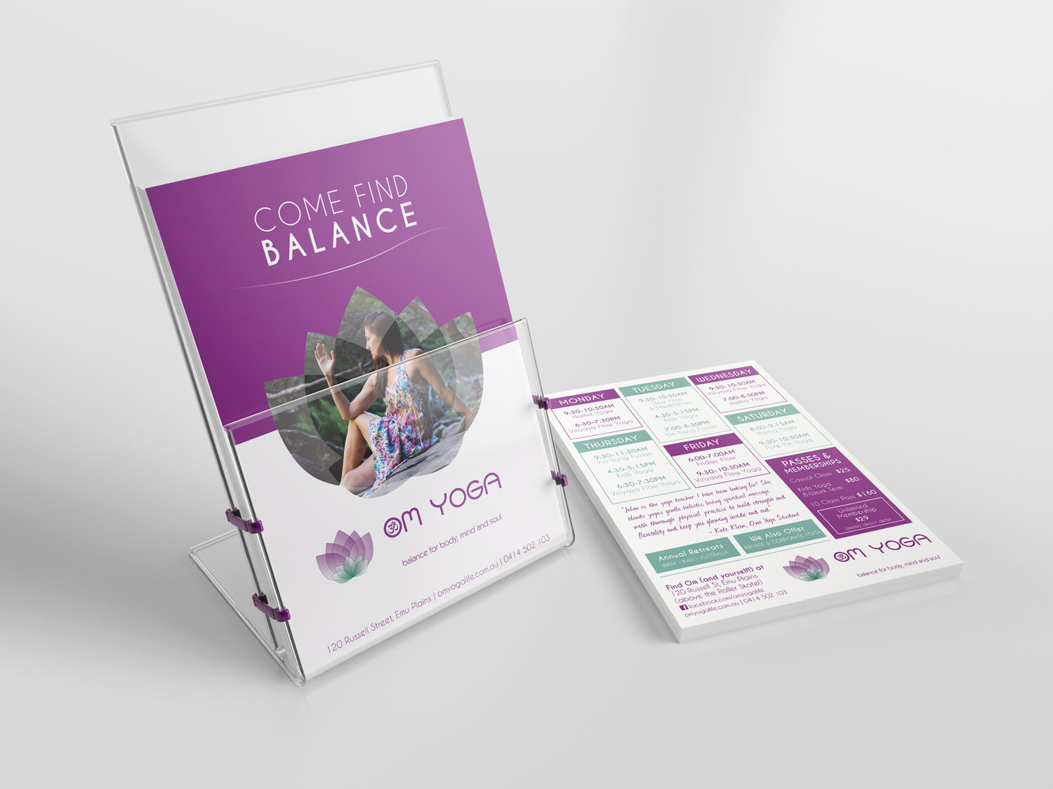
om yoga flyer
I designed an A5 double-sided flyer for a local yoga studio, Om Yoga. As there was no brand guide available, I used the studio website for inspiration, noting the colour scheme and clean, modern style.
The size, layout and wording for this flyer were all my suggestions, as the studio owner was very open about what she wanted. We agreed that the front should have an eye-catching design, with a call-to-action that was quick to read, inviting, and to the point (I came up with “Come Find Balance” as it also connected with the studio tagline, ‘Balance for body, mind and soul’). On the back I included the studio timetable, pricing, extra offerings, contact details and also a strong testimonial (which I pinched from the studio’s Facebook page reviews!).
The flyer has been placed in local shops, businesses and community centres to entice new students to Om.
ROHINGYA FLY SHEET
I designed and wrote the copy for an A4 fly sheet as part of Caritas Australia’s Rohingya Refugee Crisis Campaign. The fly sheet went out alongside a quarterly newsletter, to help raise funds and awareness for the children, women and men suffering from such horrendous abuses to their human rights.
I was asked to keep the document black and white, so I converted the original colour photo to black and white, playing with curves and levels in Photoshop to achieve a more dramatic style. The girl’s eyes are communicating so much in this image; I wanted to keep her look of strength and sadness as sharp as possible.
yoga for self-love flyer
I designed and wrote the copy for this flyer for a yoga teacher who was providing special yoga classes for women at a Domestic Violence service. The brief was that the colours should be warm and welcoming, and include a yoga pose that looked comfortable and calming (rather than intimidating!). For this flyer I used a double-exposure technique in Photoshop, also adding in a Gaussian blur behind the woman so that it looks sort of like she’s got a soft glow to her. I completed the flyer in Adobe Illustrator.
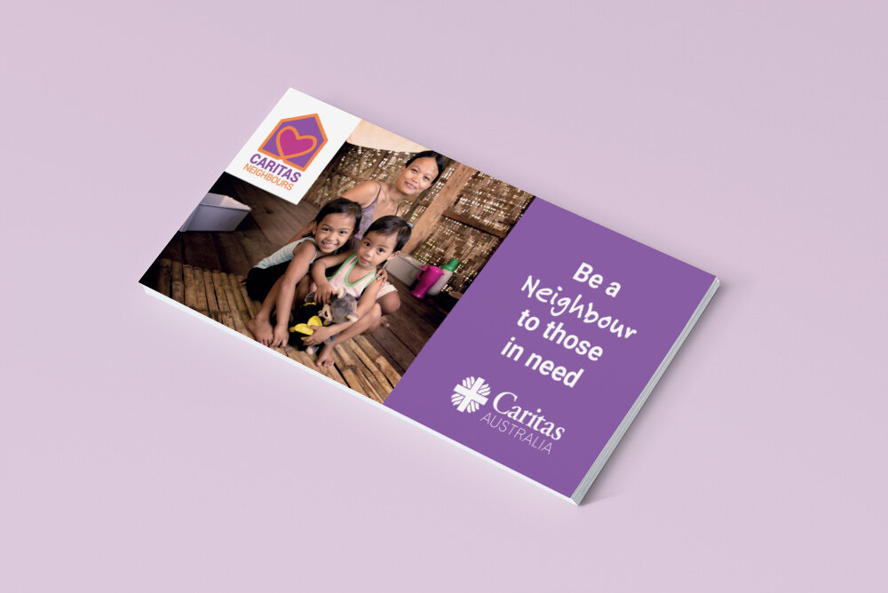


CARITAS NEIGHBOURS DL SLIP
I was asked to design a DL slip to accompany one of Caritas Australia’s quarterly newsletters. Marlin Communications had just redesigned the branding for Caritas Neighbours (Monthly Giving), so Caritas wanted to showcase the new brand and include a soft ask to become a Neighbour. I wrote the copy, and created the slip in InDesign, following the brand guidelines provided by Marlin.
At Caritas I am often provided with pre-set brand/campaign guidelines, which I use to create a wide range of additional assets, for both digital and print.


